New release of map tiles with significant changes
Forum » General Forums » Mapping

We've just put online a new release of our map tiles which we use on this site and in our GPX mapping app. We do new releases regularly, not least to pick up any changes in the data coming from OpenStreetMap and the latest updates from Ordnance Survey's OpenData programme however this release also includes some significant changes to the way we show mountainous areas. The main changes we've made are to contours and to crags:
- Contours are now slightly narrower and sharper, which works particularly well on steep ground. We're also now colouring contours of 800m or higher in grey rather than brown.
- Contours in Ireland are now less jagged.
- Crags are now both darker and sharper.
Here for example is Scafell Pike at zoom 8 on the old tiles:
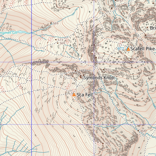
On on the new:

You can read more about this, along with more examples, in this blog post.
Whilst I do think that this new release does, overall, look better than previous versions, there is one aspect which to me, is not so good, when compared to OS mapping, and indeed the previous versions of Waymaps here on WalkLakes.
The image below is a screenshot of a 2km square area, (just east of Wasdale Head), as shown at zoom level 8 of both the new release of WalkLakes Waymaps, and of OS mapping, (1:50000 origin), both as may be seen on Walklakes GPS mapping: -
And the one below is a screenshot of a 1km wide area, (part of Kirk Fell), as shown at zoom level 9 of both the new release of WalkLakes Waymaps, and of OS mapping, (1:25000 origin), both as may be seen on Walklakes GPS mapping: -
NB: When viewed on WalkLakes, OS mapping is rendered approximately 10% smaller than Waymaps for the particular zoom level concerned, hence why the two map sections in each example don't show at exactly the same scale.
However, even though the tiles of the OS mapping are rendered "smaller", in both cases, the text relating to contour heights is much easier to read on OS, because it is in a larger font size than that on Waymaps.
Indeed, (as may be seen from the examples provided in the original post), contour height text was much easier to read in that version of Waymaps than it is now. - The text now being only - circa 50% the size it was previously.
I realise that my eyesight is not quite as "20-20" as it used to be  , but previously I could read the Waymaps contour height text "at a glance", now I have to look much more closely.
I don't know whether the text size is predetermined by the mapping sources used?, but I do feel that if it was at all possible, increasing the contour height text font size back to the size it was on the previous release, would make the maps better overall.
Regards,
Mike.
With regard to Mikes comments, looking at the maps some of the other text, like path names & minor fells like Thornythwaite fell, would benefit from being larger or somehow more distinct, it was only when I leaned forward at my desktop to read the bits of brown text on Great Gable better that I realised that there was the label Climbers Path nearby otherwise it gets lost in the crags.
OS mapping is rendered approximately 10% smaller than Waymaps for the particular zoom level
If you look carefully you'll see the Bing map is a different projection to WayMaps - i.e how you map the earth to a 2d flat surface. Consequently the grid lines on Bing are not vertical/horizontal but slightly skewed which varies across the country. They've taken the whole OSGB map and effectively warped it to fit the global web map projection. Compare Dover, Land's End, and Wick for example.
contour height text
Yes, I appear to have inadvertently changed it. I'll change it back.
Participants in these activities should be aware of and accept these risks and be responsible for their own actions.